Summary
ファミコンのCPU 6502の視覚化
Reference
Visual 6502http://www.visual6502.org/JSSim/index.html
GitHub - trebonian/visual6502
https://github.com/trebonian/visual6502


| RGraph | 同心円状に配置 |
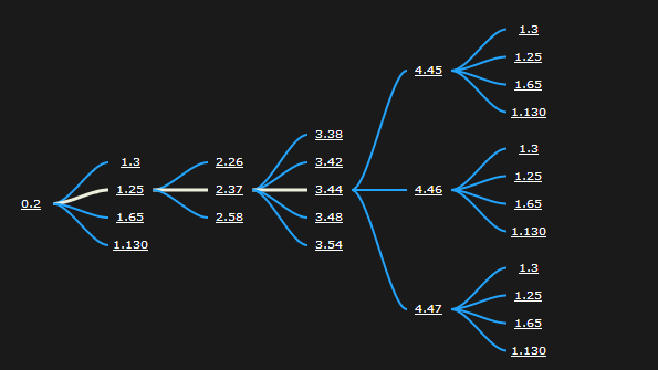
| HyperTree | 魚眼レンズのように配置。hyperbolic tree |
| SpaceTree | 階層構造の軸を持つ配置。各ノードは末端のノードが等間隔になるように配置する。 |
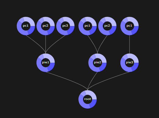
| TreeMap | 面積と色で表現。包含関係も有る。 |
Google Public Data Explorer は、
各国の出生率や寿命といった複数の統計データを組み合わせて
折れ線グラフ、棒グラフ、分布図、バブル・チャートに表示できる。